.png)
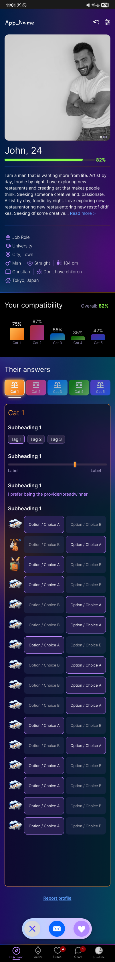
With the first wireframe, my immediate goal was to alleviate the jargon on the page. What I mean by this is that we live in the age of social media, and attention spans are at an all-time low. The first wireframe page had a plethora of words and information on it. I believe that for many users, this will confuse them and cause them to lose interest. My goal was to take the pictorial approach.
Instead of having the information written under the page I wanted to disperse it among the profile pictures. I also wanted to link their Instagram profiles to promote interest from the users.
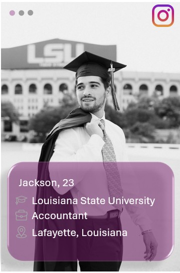
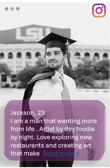
My goal was to take the pictorial approach. A picture speaks a thousand words so instead of filling the page with words icons I thought to fill it with pictures instead. My hope is to draw and maintain engagement. Applications like Instagram and Facebook are flagship when it comes to social media today because of how picture eccentric they are. For this approach I wanted all information to be fixated or centered around the profile picture(s) to gauge audience interest.
My goal was to take the pictorial approach. A picture speaks a thousand words so instead of filling the page with words icons I thought to fill it with pictures instead. My hope is to draw and maintain engagement. Applications like Instagram and Facebook are flagship when it comes to social media today because of how picture eccentric they are. For this approach I wanted all information to be fixated or centered around the profile picture(s) to gauge audience interest.
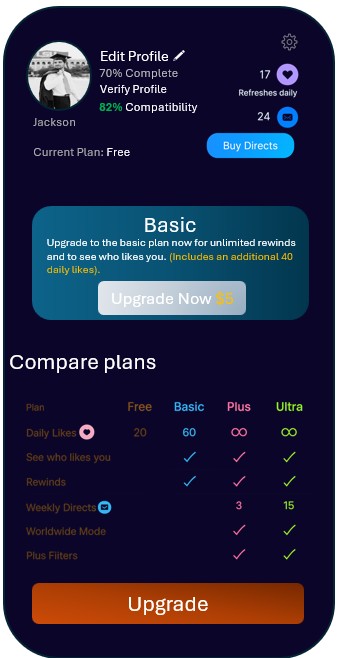
For the settings page, I wanted to create a plan of action. There was plenty of information on the page, but I wanted to fixate all the information around one element. In this instance, I wanted the settings page to be centered around driving consumer revenue. I chose for the page to have a greater emphasis on consumer upgrading. The more popular dating apps take on this approach, so I didn't view this as informal.
.png)
The new design versus the previous design encourages an immediate plan of action. Promoting the immediate upgrade to avoid overwhelming the consumer by going from the free plan to the ultra-plan. But if the user is interested in more expansive plans, they can still select them by hitting the "upgrade" button.
The "subscribe" button is relabeled as the "upgrade" button just to clarify the button's intent.
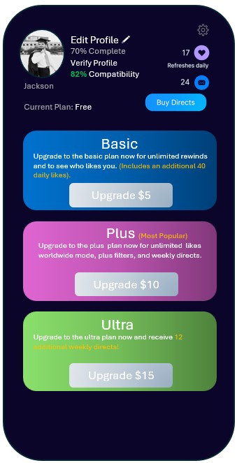
The upgrade page lays out and expands on the options that the first page did. I just amplified the graphic to encourage user engagement. I also highlighted some of the fonts in gold lettering to promote some of the features that each plan provides.
.png)
For the page, I wanted to change the setup of the questions. I felt that the first set of questions in the example had way too many questions and that it could possibly be a tad bit overwhelming for someone to gloss through if they were just swiping through suitors. I felt the best option was to condense the questions into a smaller number of Q&A questions that had a more intimate approach. So instead of asking some to select "yes" or "no" for whether or not they like long walks on the beach, they would see a prompt asking them if they like long walks on the beach, and they would answer in their own words. This is an app on a phone, not an actual face to face encounter, so I wanted to bridge the gap as much as possible to create supplicate human-like interaction.

The selection pane at the bottom of the screen was left untouched, because I didn't see it as an immediate issue. I also didn't think the selection pane played a strong factor in increases engagement with users.